- Home
- >
- Help
- >
- Online Store
- >
- Desktop view: how unify title alignment across all...
- Subscribe to RSS Feed
- Mark Thread as New
- Mark Thread as Read
- Float this Thread for Current User
- Bookmark
- Subscribe
- Printer Friendly Page
Desktop view: how unify title alignment across all sections?
I understand mobile is king and have optimized my content for mobile. However, I still wish to make sure the content doesn't look awful on desktop so I switched preview modes and found that some of the sections (text block, embed block) align very poorly with the rest of the left-aligned blocks (featured items block, Instagram feed block). It is quite the eye sore– is there any way to correct this? I tried playing around with the Customize > Layout options, but not having much luck...
Any recommendations for correcting this? Also side question: I plan to upgrade to the Professional plan soon– is the editor on the Professional plan as limited as the one on the Free plan? 😣
Thank you

- Mark as New
- Bookmark
- Subscribe
- Subscribe to RSS Feed
- Permalink
- Report
- Subscribe to RSS Feed
- Mark Thread as New
- Mark Thread as Read
- Float this Thread for Current User
- Bookmark
- Subscribe
- Printer Friendly Page
Thanks for reaching out, @meaningfull!
From testing this on my own site, the only real option here is to edit the layout of these sections so that the headers within them align with the Instagram Portfolio heading on the far left.
To do this, I've gone to Website Editor > selected the individual section > selected the heading within the section > Customise > Layout and colour. I've selected the option that places the heading on the far left. See below.
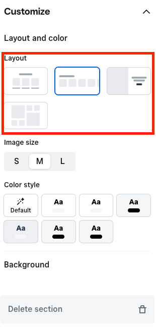
It sounds like you've tried this on your end though. As you may have noticed, this will mean those previously centred headings will show on the left when the site is viewed in Desktop mode. This feels like a limitation of the Site Editor itself and not something we can provide a workaround for at this time.
The Site Editor doesn't change when moving to the Professional Plan.
I'd encourage you to share this feedback in our Seller Community here: squ.re/ideate - Our Product Team keeps an eye on this forum as they are constantly improving our products based on feedback like this.
In the meantime, please don't hesitate to reach out with further questions here and we'll do our best to help!
Community Moderator, Australia, Square
Sign in and click Mark as Best Answer if my reply answers your question.
- Mark as New
- Bookmark
- Subscribe
- Subscribe to RSS Feed
- Permalink
- Report
Square Community
Square Products